8/12/2008
Advertising
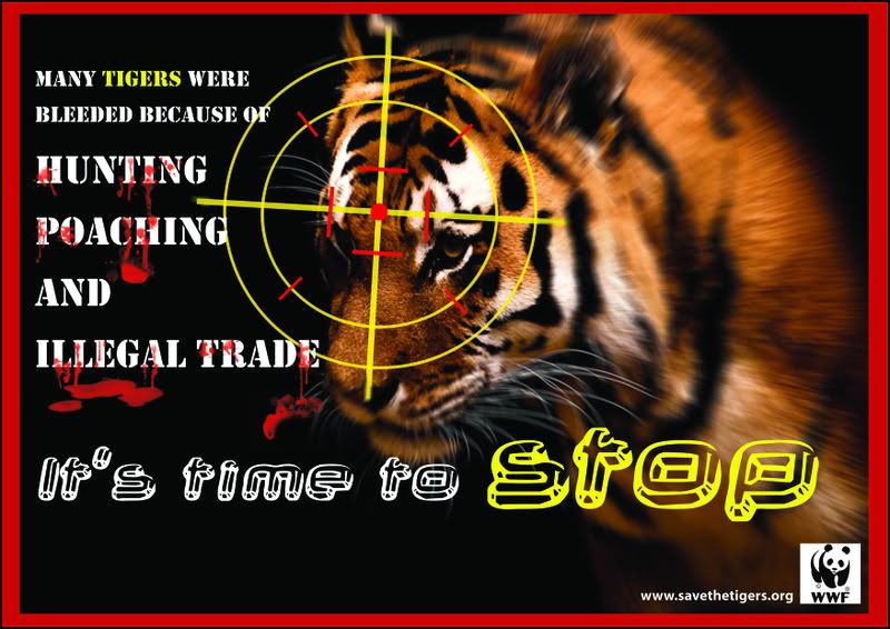
Advertisers have a mission to search for new ways to grab the interest and appetites of customers. Frequently they use words to inspire interest, but some often cases they use eye-fooling, mind-bending images-optical illusion- to make viewers impress in their mind shortly to force them to look again. The second look is the key to a successful piece of communication, and images that obtain that reaction are an very important trick of the advertising trade
New techniques for visual seduction:
1)Figure and ground
The human eyes deliver a continuous stream of data that passes unfiltered to the brain. The visual centres of our brains have to decide which piece of information establish the figure and which the background. The obvious chaos of the visual raw data is put into meaning order by this process. "What should be perceived as the subject, and what as the formless ground" are the first and most important question but the answer does not usually clear, because in many cases are not right or wrong. Sometimes different explanations will simply lead to different solutions
Reference: Stoklossa, U., 2005, 2007, "Advertising New Techniques for Visual Seduction"
8/05/2008
Rain in Flash
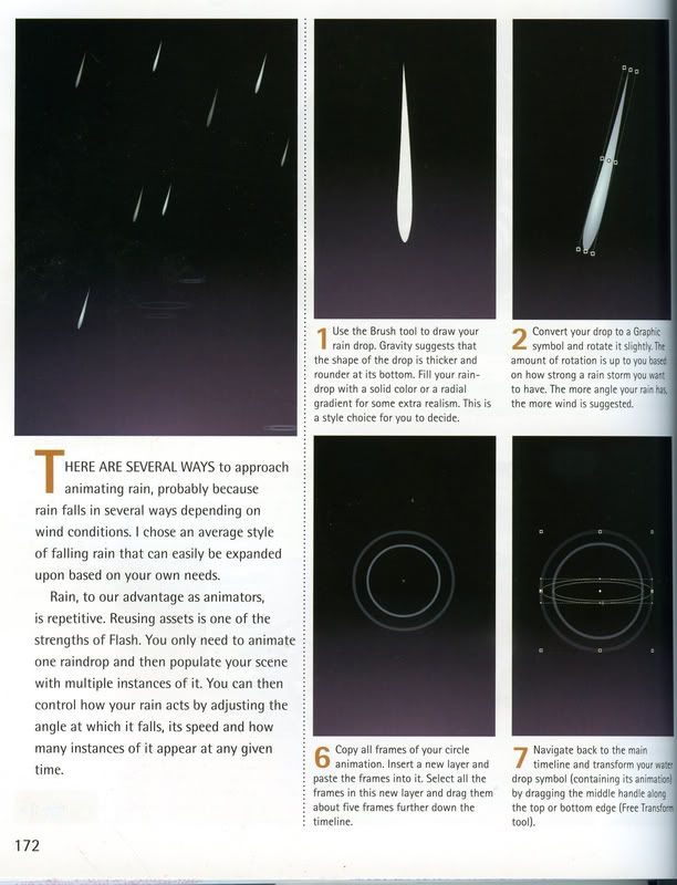
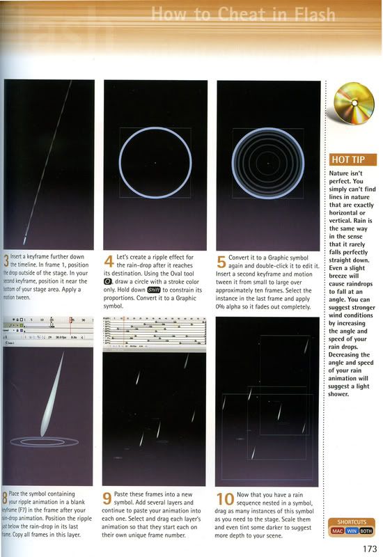
This is simple flash which I read on How to cheat on Flash book. I am trying to practice on Flash to preapre to do CV assignment. There are some ways to make rain, because rain falls in several ways depending on wind conditions. You can control how your rain acts by changing the angle which it falls. These below pictures would show you how to do rain. Hope you enjoy!!!


Reference: Georgenes, C., 2007, "How to cheat in Adope Flash CS3", first edition
8/04/2008
Poster
7/27/2008
Fun with Flash
This week I have a chance to study about the Flash so I am so interested in lecture of my lecturer so this entry I would like to show my first work on Flash. My work based on the book which I found on the library named "How to cheat in Adobe Flash CS3"
My work is so simple, I just use distord tool to make the wing of butterfly moves. The distort tool is perfect to change the perpecsive of shapes. It helps me saving the time to redraw each new angle of the wing by hand. However, I have some problems about my work, my butterfly had three parts: body and two wings. They were quite movie-clip symbols and I made the wing move in the library so in the main layer was just have one frame. When I opened swf file, this file runs normally and I exported directly to avi, mov,.... but the wing of butterfly of these files did not work.
To solve this problem, I downloaded the AnvSoft Flash to Video Converter on Internet to convert swf file to avi file. I hope you can help me to find the reason why I can not export directly!!! T_T Thank for your reading
7/23/2008
Mystery Light with Photoshop ^__^
 I am so excited with this picture which I learned on Tutorial on Internet. Now let me show you all steps to do this (very easy).
Step 4: Filter-Pixelate-Mezzotint and choose medium strokes type
Step 5: Discard color by Ctrl-shift + U or Image-Adjustments-Disaturate
 Step 6: Filter-Radial Blur with Blur method is spin, amount is 100 and quality is best
Step 7: Add color by ctrl + U or Image-Adjustment-Hue/Saturation. Color belong to you

Step 8: Filter-Twirl with angle 50
Step 9: Duplicate background layer. Filter-Twirl with angle -100

Reference: http://thegioiweb.vn/Story/vn/photoshop/huongdanphotoshop/2007/12/2009.html
I hope my entry is useful for you and hope to receive your comment
7/21/2008
Designing Simple Logo by Photoshop
Today, I would like to talk about designing logo in the Photoshop. I am an amateur so that I design this logo which is very simple, I just use gradient tool and brushes tool to make this. Now, let me show you my work
 http://i35.photobucket.com/albums/d185/babydragon224/entry5copy.jpg
Next, I would like to show you steps how I do this.
Step 1: Open new page with 600x300 pixels, black background
Step 2: Choose type tool and type (should choose big font, I chose Showcard Gothic font with International and Freestyle Script font with club)
Step 3: With the International layer, choose raterize layer
Step 4: Select selected field to International word(by ctrl + click to this layer) and use gradient tool (color are black and white), drag from top to bottom. You will have the picture as below

http://i35.photobucket.com/albums/d185/babydragon224/entry5a.jpg
Step 5: Still continue keep selected field, and select ->modify ->contract, choose 1px

http://i35.photobucket.com/albums/d185/babydragon224/entry5b.jpg
Step 6: Add new layer, paint it black. With this selected field, select ->modify ->contract, choose 2px
Step 7: Add new layer again, use gradient tool (color are white and orange). Then, drag from top to bottom

http://i35.photobucket.com/albums/d185/babydragon224/entry5c.jpg
Step 8: Until now, the picture is finished soon. We need a little bit about decoration, I just added two line and some soft brush. We have last result. Hope u enjoy it and remember comment for me

7/20/2008
Car

Illustrator
http://i35.photobucket.com/albums/d185/babydragon224/car.jpg
7/13/2008
LOGO
Every logo is an idea, sometime logo started to come as a flash or a image in our minds when the client describe their project. Sometime the logo comes to a comment mentioned in the client brief or our research. The author of this book asked a lot of designer how they evolve their concept, but no one could say or someone avoid the author's question. They just suggest pathways that we could follow to get success. Some examples:
- The brief-you get all information from the client
- Research-you research information which relate to the client such as reading on the specific industry, history and competitor
- Reference-it is a brand of research. It is visual research in which you find the style, an approach
- Concept-some designer influence mainly with graphic style and image of a piece, while many others try to create logos which bring deep meaning or contain some sort of visual puzzle
- Objectivity-taking breaks is important in creative work as in physical work. You could get tired easily of a project. By doing anything else for a period time, your idea would be insight and objectivity
- Expertise-thinking more crazy more successful ^o^, designer=contractor
- Presentation-limiting your presentation with your client, some designers usually select the ones they personally love
- Sketching
- Celebration-Celebrating a party, eating chocolate, sleeping or continuing to work other logos

Sketch Logo

Final Logo
Zuluworks is a company that make specialty product such as flight bags and flight pads for pilots. In a first time, the designer began his process by many pages and neatly drawn pen sketches (you can see on the top row), after that the designer finish his process by Adope Illustration version (on the second top row). On the first model logo, he added the Morse letter to his logo but it is unsuccessful because it ended up looking too forced and made you want to pronounce it in Swedish. On the final logo, he wanted to create an icon that represent a flight and in his process, he discovered 2 arrow could be Z letter, symbolizing taking off and landing. He choose the green, because the green related to an earlier logo of the client.
**BONUS:
Some design firms use this "questions for discussion" to help to know what their client need. These question below is real, you can follow questionnaires to create for your own. I hope this entry would be helpful for you. Thank you for reading. Now let take more a little time to read it and comment your thinking!!!
Questions For Discussion (a model client-brief form)

http://i35.photobucket.com/albums/d185/babydragon224/img002.jpg

http://i35.photobucket.com/albums/d185/babydragon224/img003.jpg
Click to these links to see full size
Reference: Cabarga,L. 2007, The secret life of logos, 1st edn, F + W Publication Inc., China
7/11/2008
Manga VS Comics
Differences are:
- Manga is printed in black and white and comics are popularly printed in full color
- Manga is not only usually smaller than traditional comics but also usually printed with digest-size** and half to one third the size of comics
**digest-size = letter size piece of paper is fold in half. The actual dimension of a finished digest-size for publishing is 5.5 x 8.25 inches and this dimension can fluctuate depending on the size of the sheet of paper and the amount of trim
- Manga books are thick and can be hundred of pages in length. Comic books are normally thinner than manga books and comic books look like the small magazine, can be run about 32 pages
- Manga books are frequently apart of an large story so that a complete storyline of manga can run to a thousand of pages. Comic books are often single unified story and collected monthly
- Comic books are usually created by a sort of assembly-line fashion that are a writer (story), a pencilier (initial sketch), a inker, a letterer (adds dialog) and a colorist. Manga books are often just only one person who combines all of works above
- Manga is usually showed emotion better than comics. If you watch carefully manga and comic, you would see the eye, the hair, specially the clothes of manga are very depth

http://www.animebyyou.com/Aart/P%20Anime%20kenshin%202.jpg

Comic
http://www.geocities.com/Area51/Rampart/8644/xmen.gif
Reference: http://ezinearticles.com/?Comic-Books---Japanese-Manga-vs-American-Comics&id=206944
7/06/2008
The interview with author of entry 2
- Me: Hi my friends!!! Today I would like to continue with the Photoshop software ^__^
- Friends: so what is different between this entry with entry 1??? o__O
- Me: Calm down, everyone!!! :)) This difference is effect^^!
- Friends: EFFECT???
- Me: Absolutely, I added some effects into the picture so the picture is romantic and ...I don't know how to describe it T^T. Let me show the picture and feel it by yourself
Original picture

After editing
http://i35.photobucket.com/albums/d185/babydragon224/100_2489q.jpg
- Friends: What kind of effects did you add to your picture???
- Me: Ahhh....the effects I used is Gaussian Blur, and Render Cloud. In addition, I used Blending mode (Screening). And the reason I choose this picture because I saw the principle of design which I studied on DIM2 class, the principle is proportion (rule of third). With this principle, the picture is divided 3 sections horizontally and vertically lines. Beside that the model is far from center of the picture and put into one of 3 sections. In addition, I want to talk about dominance (principle of design). Firstly, the model is primary emphasis so that the model is dominant. Secondly, the stone is secondly emphasis so the stone is sub-dominant. Finally, sky and sea are farest viewer so it is tertiary emphasis (subordinate)

Rule of third
http://i35.photobucket.com/albums/d185/babydragon224/1.jpg
....The End
So this is the end of my entry 2. It is so great to receive your comment. Thank you!!!
7/04/2008
My first Entry-Readdddd and Feellllllllll ^o^
After I studied two weeks in DIM2 class about the Photoshop software. I really like Photoshop because one of my interests is editing the picture so that today I would like to introduce to you about this picture which would be edited by Photoshop software, and how can I edit this picture
Before
This picture was taken at studio 3 in RMIT University, the model is my friend-Cho Hana. You could see the original picture has some errors such as hair on the face, and this picture is simple. In process of editing this picture, I used Clone stamp tool and Spot Healing Brush tool to remove the hair on her face. After that I used Hue/Saturation and made it to black and white picture then I used History Brush tool to recover original color on her face. As a result the picture seems to be more depth and attractive (^_^). Finally I created the black lines for this picture to look professionally.

After
What do you think about my work???I would be happy to receive your comments . Thank you for reading ^^!


